Dear Shadow Chancellor,
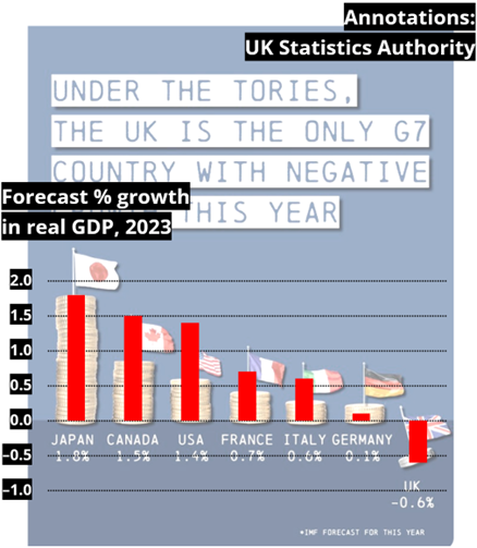
I am writing to you about a graphic posted on your Twitter timeline on 14 March showing the GDP growth rates forecast for each of the G7 countries by the International Monetary Fund in January.
An important role of data visualisation is to aid understanding of the data. But in this case the graph is misleading as neither the piles of coins nor the flags display the growth forecasts to scale, as shown in the annotated version in this letter. That said, it remains the case though that the UK was the only country for which negative growth was forecast.
Officials from the UK Statistics Authority have spoken to your office on this subject.
Yours sincerely,
Sir Robert Chote
Chair of the UK Statistics Authority