Dear Mr Gwynne,
Thank you for your letter of 18 November regarding the chart reproduced below that was tweeted by the Department of Health and Social Care (DHSC) on 10 November to show the recent evolution of the pay of nurses.
You raised two issues:
- First, you argued that it was “disingenuous to claim that nurses have been awarded a pay rise”, by focusing on particular points in nurses’ pay bands and comparing cash figures between 2020-21 and 2022-23 rather than real (i.e. inflation-adjusted) figures over a longer period, for example since 2010. It is perfectly reasonable to debate whether cash or real-terms figures are a more appropriate basis for comparison, and what time period and points in the pay bands should be used, but the chart is not in itself misleading in this regard. That said, the department could have provided a link to the source data [1] [2] [3] as recommended in the Government Analysis Function’s guidance on charts and as it has done in other cases. This would allow readers to understand the precise definitions used, verify the figures and put them in a longer-term context. The Office for Statistics Regulation – the regulatory arm of the UK Statistics Authority – has raised this issue with the department, which I gather intends to publish a blog explaining the basis for the figures used.
- Second, you argued that, even given these choices, the chart was misleading in how it was drawn – partly because the y-axis does not start at zero and partly because the slopes of the lines do not appear to reflect the underlying figures. I agree that this is a poor and misleading representation of the underlying data that risks damaging public confidence in the presentation of official statistics by the department. Beginning the y-axis at around £20,000 exaggerates the proportionate increase in pay over the period and for this type of reason, breaks in axes of this sort should usually be avoided or at least shown transparently in the way they are labelled and formatted. In addition, as shown below, the freehand way in which the lines appear to have been drawn suggests a bigger relative increase in pay for newly qualified nurses and a bigger pay premium for “a few years’ experience” than the underlying data justify.
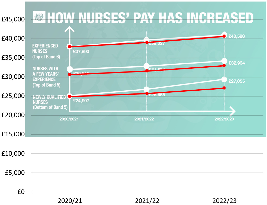
The shortcomings of this presentation underline how important it is that political and communications teams within departments consult and listen carefully to their Heads of Profession for Statistics before publishing high-profile numbers or data visualisations of this sort. Failure to do so can undermine public confidence in the outputs of the department and in the presentation of official statistics more broadly.
In addition to sharing our conclusions with the department, I am copying this letter to the Chief Executive of the Government Communication Service.
Yours sincerely,
Sir Robert Chote
Chair
Related links
Andrew Gwynne to Sir Robert Chote – DHSC chart on nurses’ pay