Presentation of geospatial data
Map design and choice is a complex topic, the subject of extensive university and online courses and a number of sources are available providing guidance (see ’Where can I find out more?’). Whilst there is much more to the topic than we can attempt to cover here, a few principles that touch on ethical issues are worthy of mention.
As far as possible map design decisions should provide a fair view of reality
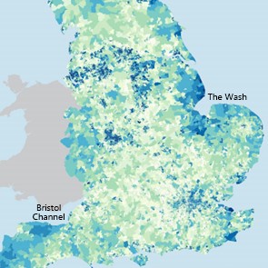 The wrong type of map choice can produce a completely false impression – particularly for inexpert users or the public. Where a choropleth (coloured area) map has been used for example it is very easy for an inexpert (or even expert!) user to be misled. Large areas, perhaps rural areas with relatively small populations, tend to dominate visually while physically small urban areas can get neglected. Notice, for example, the large areas around the Wash or south of the Bristol Channel on this map of deprivation. Whilst these are undoubtedly areas that deserve attention, London, Birmingham and the northern urban centres are much more populous but much less obvious on this map.
In some cases it may be helpful to look at the use of cartograms, which attempt to overcome potentially misleading area effects by using areas of visually similar size or adjusted to represent the variable being presented.
Even the map projection used can be misleading – particularly for the mapping of world data. The Mercator projection, traditionally used for statistical maps, focused attention on the ‘developed’ northern hemisphere at the expense of Africa and South America – a straight-forward, ‘baked-in’ cultural bias. An equal-area world projection provides a much ‘fairer’ view of the world and should be used for most statistical comparison purposes. One key exception to this would be presenting data where flows or distance matter, in which case an equidistant projection might be a better choice.
See worldmapper.org for some interesting examples of cartograms used to draw out the real stories from world data.
Take extra care in your choice of colours
The choice of colour schemes needs to be particularly sensitive to the phenomenon being mapped, ideally avoiding colours that might convey positive or negative associations with particular political parties or religious groups strongly associated with particular colours. Users’ attention is sure to be drawn to bright colours at the expense of other areas. Red traditionally spells danger, while dark or dull colours can imply a negative association. It is entirely appropriate to use all of these associations in your map design – but your choices must be the result of conscious, active decisions and fair to the subject.
Remember too, that the way in which you present missing or uncertain values has potential to bias the user’s reading of a map. Missing data is not the same as a zero value. It important that these are shown differently and in a way that doesn’t unfairly influence its message.
Don’t let a good story get in the way of an honest map
Whilst it is perfectly appropriate to design a map in such a way as to draw out the patterns in data it is important not to choose colours or statistical ranges that misrepresent – or make a problem look better or worse than it really is (see ‘Where can I find out more?’ below for further information about this).
The key questions to ask here are: Do the choice of ranges, colours and symbolisation provide a fair reflection of reality or have they been chosen entirely to unfairly emphasise a particular story? Telling stories is fine – but they must be accurate and any biases clearly pointed out.
 This discussion on the buzzfeed website provides an excellent example where the map symbolisation chosen to dramatize the situation has resulted in a very skewed version of reality. In this case the problem is compounded by sharing on social media. Always remember your results may be used and repeated out of context – as far as possible maps should tell the truth on their own.
The data, not the medium or desired policy should define the story. Sometimes it is worth presenting the same data in several different ways – or including graphs or other graphics to support the mapping.
It is a good test to look at your final results or mapping and consider: What would a reader coming to this completely fresh read from this map? Is that reading a fair reflection of the data or relationships here? As ever it is important not to lose the truth in the interest of a more interesting, or more convenient, story.
Back to top